Poverty may have declined, but deprivation and poverty are still worst in the former homelands
Introduction
In 1951 the Bantu Authorities Act established ten ‘homelands’ for different black African groups. Although the homelands were incorporated into the Republic of South Africa in 1994, these areas still differ markedly from others within the country in terms of deprivation and income poverty. There have been some improvements – e.g. Von Fintel & Pienaar report a drop in hunger levels in former homelands (Econ3x3 2014). However, if one considers that over a third of South Africa’s population still live in a former homeland area, it is essential to ascertain how people living in these areas have fared more generally in the post-apartheid period.
An analysis using data from the 2011 Census shows that deprivation, measured in terms of a ‘multiple deprivation index’, is still concentrated in the former homelands. Moreover, a very similar spatial distribution is found for poverty when the measurement is based on income. Apartheid’s spatial legacy regarding poverty and deprivation remains one of the greatest challenges confronting South Africa.
Measuring multiple deprivation
In this article, deprivation is conceptualised as a lack of material possessions, social and human capital, decent housing and basic services (Townsend, 1987). We use the South African Index of Multiple Deprivation 2011 (SAIMD 2011) which measures different dimensions or ‘domains’ of deprivation at the level of small areas, i.e. in electoral wards.[1] It builds on previous work undertaken in collaboration with the Department of Social Development and Statistics SA to help identify the most deprived areas in South Africa (see Noble et al. 2006). The domains and indicators were determined after widespread consultation. (In measuring deprivation in terms of several dimensions, the SAIMD is similar to the Multidimensional Poverty Index or MPI. However, it is constructed and interpreted somewhat differently. [2] See Finn et al. 2013 on Econ3x3.)
The SA Index of Multiple Deprivation for 2011 is a weighted combination of four domains of deprivation: material deprivation, employment deprivation, education deprivation and living environment deprivation (see Noble et al. 2013). Table 1 shows the relevant population and the indicators of deprivation for each.
Table 1: Indicators of deprivation for the SA Index of Multiple Deprivation 2011
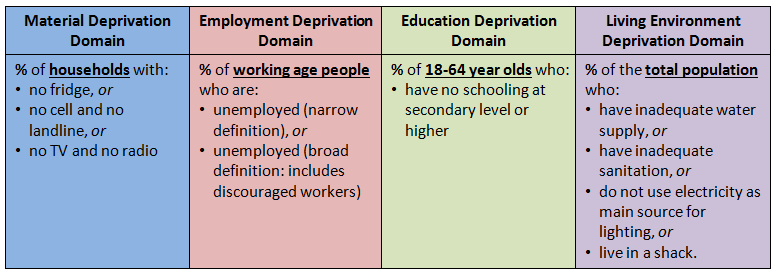
A person is counted as deprived in a domain if that person is deprived for one (or more) indicator(s) in a domain. We use 2011 Census data to calculate the proportion of the relevant population that is deprived with regard to each domain. (The scores for the four domains can then be combined with equal weights to generate the ward-level SAIMD score, which is used for ranking the wards.)
Multiple deprivation in the former homelands in 2011 (and 2001)
In the first instance the SAIMD scores for 2011 are used to rank all the wards in the country and then analyse their location in South Africa. If we look at the most deprived 20% of wards (i.e. the bottom quintile) across South Africa using the SAIMD 2011, the vast majority of them, i.e. 90%, are located within former homeland areas.
Figure 1. Levels of multiple deprivation in the former Transkei and Ciskei 2011
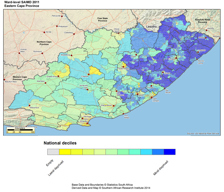
The map in figure 1 illustrates this spatial pattern for the Eastern Cape (for such maps of other provinces, see Noble et al. 2013). The most deprived wards are shaded deep blue whilst the least deprived are shaded bright yellow, with a gradation in between as shown in the map’s legend. The areas with the highest levels of multiple deprivation clearly are concentrated in the former Transkei (the north-eastern section north of the Kei river). For the former Ciskei homeland, deprivation levels likewise are significant, but they are not as high as in the Transkei areas (see the lighter blue areas south of the Kei river mouth).
Secondly, the SAIMD scores can be used to calculate rates of deprivation for areas such as the former homelands. Table 2 shows the rates of deprivation for each of the IMD domains for each of the former homelands and, for comparison, the rest of South Africa (all for 2011). Within a domain, the higher the score, the more deprived the homeland area. (The scores should not be compared between domains/columns as they have different ranges and different populations; see table 1 or Noble et al. 2013: 19.)
Table 2. Multiple deprivation in the former homelands in 2011
(percentage of the relevant population – see Table 1)
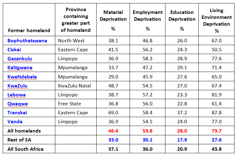
The former Transkei in the Eastern Cape has the highest rates of deprivation for all four domains of deprivation. In the former Transkei nearly 88% of the population is deprived with regard to the living environment; the former homelands in Limpopo also score very highly (badly) for this domain (82% for Lebowa, 78% for Gazankulu and 77% for Venda).
The former Ciskei, also in the Eastern Cape, has a much lower score – and indeed the lowest deprivation score of all for this domain: 51%. The former KwaNdebele area, in Mpumalanga province, has the lowest percentage in two domains, i.e. material deprivation and employment deprivation, while the Qwaqwa area fares best in terms of education: only 23% of its population was educationally deprived in 2011.
Deprivation rates for the rest of South Africa are dramatically lower than the average for the former homelands, with only 28% (against 74%) of the population being deprived in the living environment domain, 18% (against 28%) in the education domain, 30% (against 54%) in the employment domain – and 33% (against 46%) being in a situation of material deprivation. Former homelands, therefore, continue to carry a heavier burden of multiple deprivation than the rest of South Africa.
The gap between the former homelands and the rest of South Africa has hardly changed from 2001 when the former homelands also had average scores significantly worse than those for the rest of South Africa (Noble & Wright 2013: 197). Due to a somewhat different construction of the IMD for 2001, the scores for the different domains are not directly comparable, except for education. Still, the proportional gap between the average homeland scores and those of the ‘rest’ have remained similar. For education deprivation, which is directly comparable, the average score for the former homelands in 2001 was 47.3 in contrast to 30.2 for the rest of South Africa – a gap of 57%. Ten years later, in 2011, that gap was almost unchanged at 56%. (The former Transkei remained the worst-off area throughout this period).
Nevertheless, while significant deprivation gaps remain between the former homelands and the rest of South Africa, the overall levels of deprivation in the former homelands (and in the rest of the country) have declined significantly since 2001. For instance, for education the average deprivation score for all former homelands has declined from 47% in 2001 to 28% in 2011; for the rest of SA it has declined from 30% in 2001 to 18% in 2011.
Income poverty in the former homelands
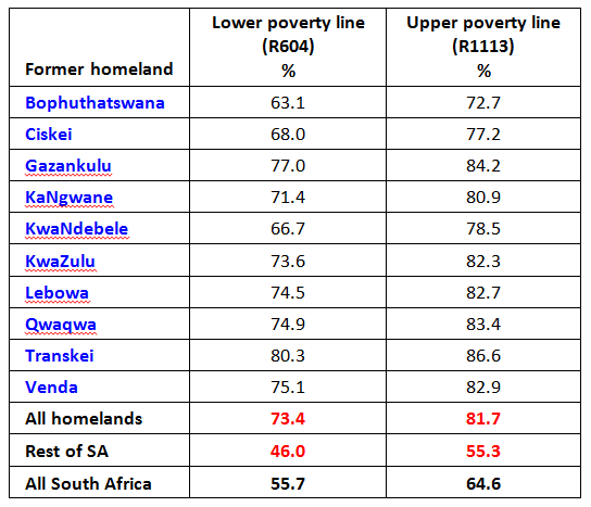
To complement our multidimensional analysis of deprivation, we also measure poverty in the former homelands in terms of income. We define poverty purely as a lack of resources to obtain needed items and services. To enable comparisons with other studies we use the Hoogeveen and Ozler poverty lines (see Leibbrandt et al. 2010). If we express these poverty lines in 2011 prices, using the consumer price index (CPI), it yields a lower-bound poverty line of R604 per capita per month and an upper-bound poverty line of R1 113 per capita per month.
Using the 2011 Census data, we calculated poverty headcount rates at ward level across South Africa and then for each former homeland.[3] For 2011 the poverty headcount ratio for South Africa as a whole is 0.56 for the lower bound line and 0.65 for the upper bound line. While it is notoriously difficult to compare poverty rates from different studies – they typically use different poverty lines, data sources and concepts of income, for example – these figures compare reasonably well with those calculated from the first wave of the National Income Dynamics Study (NIDS) (e.g. Leibbrandt et al. 2010: 35; also Rogan 2014 on Econ3x3).
As far as each former homeland is concerned, an aggregation of the ward-level data yields the income-based poverty rate in table 3. When we use the lower bound poverty line, the average poverty rate for all of the former homelands is 73%, compared to 46% for the rest of South Africa – a significant gap by any measure.
Table 3. Income poverty in the former homelands and South Africa
(% of the population below the poverty line)
The following map shows the spatial distribution of income poverty (based on the lower poverty line) in wards within the Eastern Cape.
Figure 2. Levels of income poverty in the former Transkei and Ciskei 2011
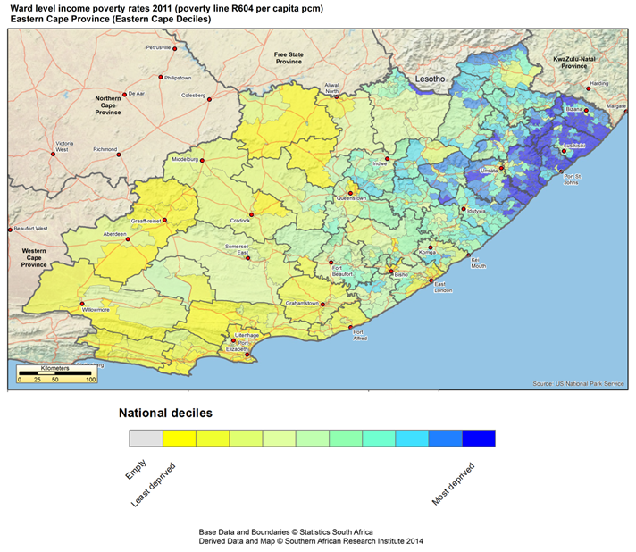
As with multiple deprivation, within the Eastern Cape the two former homeland areas are prominent, with the former Transkei being the worst off in terms of income-based poverty (having an average income poverty rate of 80% in 2011).
Conclusion
Even though there is evidence to suggest that there are declining levels of hunger in former homelands as a result of the expansion of social grants (Von Fintel & Pienaar 2014), high overall levels of income poverty as well as multiple deprivation continue to mark the former homelands. Almost twenty years ago the former homelands were identified as having the highest levels of poverty and deprivation (Klasen 1997). In 2011 they still were the poorest and the most deprived areas of South Africa. Indeed, the deprivation gap between them and the rest of the country has not narrowed in the period 2001-2011.
The implication of these findings is that current and future efforts to reduce deprivation and poverty in South Africa – in whatever guise – would need to prioritise former homeland areas. Otherwise the spatial echoes of the former homelands will revisit us for many years to come.
References
Finn A., Leibbrandt M. & Woolard I. 2013. The significant decline in poverty in its many dimensions since 1993. Econ3x3, July.
Klasen S. 1997. Poverty and inequality in South Africa: An analysis of the 1993 SALDRU
survey. Social Indicators Research 41: 51–94.
Leibbrandt M., Woolard I., Finn A. & Argent J. 2010. Trends in South African income distribution and poverty since the fall of apartheid. OECD Social, Employment and Migration Working Paper No. 101. Paris: OECD Directorate for Employment, Labour and Social Affairs.
Noble, M. et al. 2006. The Provincial Indices of Multiple Deprivation for South Africa 2001. Oxford.
Noble M., Zembe W., Wright G. & Avenell D. 2013. Multiple Deprivation and Income Poverty at Small Area Level in South Africa in 2011 Cape Town: SASPRI.
Available at http://www.saspri.org/wp-content/uploads/SAIMD%202011%20at%20ward%20level%20National%20Report%20for%20Web.pdf
Noble M. & Wright G. 2013. Using indicators of multiple deprivation to demonstrate the spatial legacy of Apartheid in South Africa. Social Indicators Research 112(1): 187-201.
Rogan M. 2014. Poverty may have declined, but women and female-headed households still suffer most. Econ3x3, May 2014.
Townsend P. 1987. Deprivation. Journal of Social Policy 16(2): 125-146.
Von Fintel D. & Pienaar P. 2014. How did hunger levels in the former homelands catch up with the rest of South Africa? A hundred years after the Land Act of 1913. Econ3x3, January.
[1] The 2011 municipal demarcation wards were used.
[2] The SAIMD methodology was specifically designed to use data from the census to measure multiple deprivation at the small area level to inform the targeting of area-based policies; such indices have been used in this way for more than forty years internationally. Accordingly, the SAIMD measures the proportion of people in a specific small geographical area that experiences deprivation in a particular domain; the domain scores can then be combined at an area level to produce a SAIMD score to be used for ranking the areas. On the other hand, the MPI was initially designed to enable national-level comparisons over time or between countries. Therefore, the MPI measures the attainment (or access) of individuals or households in several dimensions of poverty at a national level and then combines them through weighting; the overall MPI headcount ratio (H) is the proportion of the national population that is multidimensionally poor. For an application of the MPI that shows the decline in poverty in South Africa, see Finn et al. (2013) on Econ3x3.
[3] To produce ward level data, it was necessary to derive information on income from the 2011 Census as no survey source is reliable for such small areas. Constructing this measure using published census data required a number of data manipulations which enabled the computation of a poverty headcount ratio for each ward, for each former homeland and South Africa.
Download article
Post a commentary
This comment facility is intended for considered commentaries to stimulate substantive debate. Comments may be screened by an editor before they appear online. To comment one must be registered and logged in.
This comment facility is intended for considered commentaries to stimulate substantive debate. Comments may be screened by an editor before they appear online. Please view "Submitting a commentary" for more information.