Wealth inequality – striking new insights from tax data
Why wealth matters
The level and distribution of wealth in a country are important indicators of the longer-run welfare of its citizens. Whereas income and consumption tell us something of the current living standards of a household or a society, data on assets and debts are important in assessing whether households can maintain these living standards during spells of unemployment or throughout their retirement.
Wealth also provides a basis for income generation. This is because wealth can generate its own income (such as interest, dividends, rents or capital gains) and because it can be passed on between generations. Parents can bequeath assets to their children who can further grow them by saving or re-investing the gains. Over time, small differences in assets can thus grow to large inequalities. It is for this reason that, all over the world, wealth tends to be even more unequally distributed than labour income.
Since Thomas Piketty published his influential book on wealth and inequality (Capital in the 21st Century) in 2014, the issue of wealth inequality has received a lot of attention – particularly during his visit to South Africa. In countries such as South Africa where wealth inequality is particularly high, policy makers have started to ask how to use monetary or tax policy to promote greater equality with regards to wealth as well as to income.
This article reports on recent research findings (Orthofer 2016), as part of the overall REDI3x3 project. This particular research is unique in South Africa because it uses information from personal income tax records. These data were made available by SARS to REDI3x3 to undertake research that would be useful to the Davis Tax Commission. As is done internationally, the data were made available to the researcher especially for this study and only under tightly-regulated conditions that shielded the identities of individual taxpayers.
Why wealth is difficult to measure
Although we know that the distribution of wealth amongst the population is probably very unequal in South Africa, it is very hard to measure precisely how unequal it is. This is because our usual tools to measure well-being and inequality tend to fare less well with regard to wealth than with regard to income or consumption.
The most widely used data on living standards come from large-scale household surveys. The main limitation of such surveys for measuring wealth is that participation is voluntary and that richer households tend to be less likely to participate than the rest. The omission of households that are at the top of the distribution can influence the results significantly. In addition, many people are not aware of the current value of their assets – or, if they are aware of it, they feel uncomfortable about conveying this value to the survey interviewer.
Because of these limitations, researchers have started to use data from tax records as an alternative source of information on wealth. Since tax filings are mandatory (at least for people with income above a certain threshold), tax data do not run the risk of under-representing individuals and households at the top of the distribution.
Nevertheless, tax data have their own limitations. First, they tell us nothing about the population whose income is too low to require income tax filing. In South Africa this group comprises more than 80% of the population. Secondly, they do not allow us to measure wealth directly, since wealth itself is not taxed in South Africa (nor in most other countries). One therefore has to approximate the distribution of wealth through measuring the distribution of taxable income from investment. While this introduces an element of uncertainty, this method probably provides the current best way to get a picture of the distribution of wealth.
How we measure wealth distribution
The main data source for this research is a specially-provided 20%-sample of the Personal Income Tax (PIT) assessment for the 2010–2011 tax year. This PIT sample provides information on the investment income from personal income tax records; it comprises almost 1.2 million individuals.
In using these data one needs to address the fact that more than 80% of the South African adult population receives so little income that they are not included in the personal income tax system and database. To address this gap I estimated, or imputed, their income from a so-called log-normal distribution.[1] That enabled me to use the PIT data to generate a reliable approximation for the population as a whole.
I also compare the PIT data with data from the National Income Dynamics Survey (NIDS), which includes wealth as a special theme. Conducted during 2010-2011, the second wave of the NIDS provides information on the value of financial and housing assets as well as the debts of almost 20 000 adults. This enables a comparison of the distribution of wealth from two sources.
What we find: extreme wealth inequality
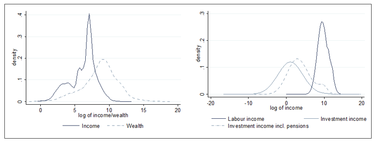
Figure 1 shows the NIDS and PIT data, using so-called density charts which reflect the number of observations at different levels of income or wealth. The narrower such a density curve, the more equal is the distribution of income or wealth, i.e. more observations (individuals or households) are clustered close to the mean. The wider the curve, the more unequal is the distribution, as more people are either much poorer or much richer than the mean value.
In the NIDS-based diagram on the left, the (dashed) density curve for wealth is much wider than that for labour income (solid line). This shows that wealth is much more unequally distributed than income. The right-hand diagram, using the PIT data, shows a similar result: a wider distribution for investment income than for labour income. Despite using two quite different data sets, the distributional analysis show similar tendencies.
Figure 1: Income and wealth distribution: NIDS data (left chart) and PIT data (right chart)
A more analytical way to compare to distributions is by calculating top income and top wealth shares. The two data sources yield very similar results:
- The wealthiest 10% of the population own at least 90–95% of all wealth, whereas the highest-earning 10% receive (‘only’) 55–60% of income.
- The next 40% of the population — the group that is often considered to be the middle class — earn about 30-35% of all income, but only own 5-10 % of all wealth.
- The poorest 50% of the population, who earn about 10% of all income, own no measurable wealth.
Although the top income shares are very high in their own right, they pale in comparison with the top wealth shares. Compared to income, wealth is much more concentrated in the hands of the few.
The high inequality with regard to wealth is confirmed by estimated values of the Gini coefficient (with a value of zero indicating complete equality and a value of one indicating maximum inequality). For income, the South African Gini coefficient is around 0.7 in both datasets, while for wealth it is at least 0.9–0.95. Both these values are higher than in any other major economy for which such data exist.
Wealth inequality and race
Since race continues to play an important role in post-apartheid South Africa, I also use the demographic information from the NIDS to study the distribution of wealth between and within racial groups. I find that white and Indian households are still much wealthier on average than Africans and coloured households. However, wealth inequality within the majority black population exceeds nation-wide wealth inequality by far.
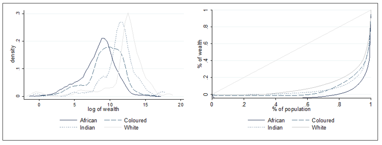
The difference in the distributions between population groups can be seen in Figure 2. The left-hand diagram shows density curves of wealth for each racial group.
- The difference in the position of these curves shows how much wealth levels differ between racial groups: the bulk of the white group (solid light-grey line) is much farther to the right than the bulk of the African group (solid dark line), although the two distributions overlap. This means that the white distribution of wealth is clustered around higher mean values than those of the others.
- The difference in the width of the curves shows the degree of wealth inequality within each group: the African distribution is much wider than the white distribution, showing that the disparity between rich and poor African households is larger than that among white households.
The right-hand diagram in figure 2 shows a different way of representing this disparity, i.e. using so-called Lorenz curves. It orders all observations from poorest to richest (on the bottom axis) and plots their combined share of wealth (measured on the vertical axis).[2] The curvature of the Lorenz curve illustrates the degree of inequality; a relatively gradual curve indicates lower inequality. This means that, the steeper the curve on the right-hand side, the higher the degree of inequality: a large share of the population owns almost no wealth and wealth shares only rise towards the very right of the chart. The Lorenz curve for the African population (the solid dark line) is much steeper than the curve for the white population (the solid light-grey line) – again indicating that the highest wealth inequality is found within the African group.
Figure 2: Wealth distribution by population group, NIDS 2010-2011
These results are consistent with findings on income inequality, according to which the highly unequal income distribution is increasingly shaped by growing inequality within race groups rather than inequality between race groups (Leibbrandt et al. 2010).
Conclusion: possible implications for tax policy
In his book, Piketty argues that much of the political stability and economic prosperity of the advanced economies in the 20th century is related to the emergence of a ‘propertied middle class’. This research suggests that South Africa has not yet experienced a comparable transformation. While there may be a growing middle class with regards to income (the middle 40% of the income distribution come close to owning a ‘fair’ share of 30-35% of all income), there is no middle class with regard to wealth: the middle 40% of the wealth distribution is almost as asset-poor as the bottom 50%.
In theory, the extreme concentration of wealth in the hands of a small portion of the adult population can be addressed from two sides: redistributing wealth at the top (primarily through capital-related taxes), or building wealth in the bottom (for instance by promoting saving and investment among middle-class households). Given South Africa’s relatively low level of private wealth and its reliance on foreign capital inflow, policies to create a more equal distribution of wealth should attempt to balance these considerations.
With regards to wealth taxation, this research would support a revenue-neutral shift in tax policy from employment-related to capital-related taxes; such a shift could benefit the middle class relative to top wealth holders. The bulk of tax revenue is currently collected from employment income (35% of the total tax revenue), while taxes on capital and investment income play a much smaller role (1%). Wealth itself is taxed only through the estate duty, which is not very effective in its current form, generating only 0.1% of total tax revenue. Since those with high income do not necessarily own a lot of wealth, while the wealthy may not earn high income/salaries (i.e. income and wealth are not highly correlated), this means that households at the upper end of the income distribution might actually be taxed much more heavily than households at the top of the wealth distribution. The current proposals of the Davis Tax Committee, which aim to close loopholes in the estate duty and increase the proceeds from the taxation of wealth, could help initiate such a shift (Davis Tax Committee, 2015).
However, there are many practical challenges with regards to an effective taxation of wealth. Most forms of wealth are changeable and mobile, which means that wealth can easily be shifted between asset classes, ownership structures and tax jurisdictions to avoid being subject to taxation. The recent Panama Papers leak indicated the extent to which the efficacy of wealth taxes is limited by the fact that large fortunes are moved out of the reach of national tax authorities.
While the two available data sources agree that wealth is extremely concentrated in a certain section of the population, neither set of data is yet adequate to support the design of effective tax policy measures. It is imperative to obtain better data on wealth, for instance by integrating the personal income tax database with other tax databases (such as the Dividend Withholding Tax system, the deeds office, credit bureaus, and the tax files of trusts) and by improving the coverage of wealthy households in the NIDS. The resulting data should then not only allow analysts to pin down the nature and magnitude of the problem, but also to design targeted tax policies and evaluate their impact.
At the same time, economic policy has a role to play in wealth formation amongst middle-class households. Monetary policy can promote saving and investment by keeping inflation rates stable, while progressive taxation can encourage middle-class saving. However, the single most important form of wealth for the middle class is their pensions. The proposals by the National Treasury to increase the coverage of occupational pension systems might have the biggest impact yet on the development of a more equitable wealth distribution. If participation rates were to increase and pre-retirement withdrawals reduced, this would help significantly to foster middle-class wealth formation, potentially lowering overall wealth inequality.
References
Davis Tax Committee (2015). First Interim Report on Estate Duty for the Minister of Finance.
Leibbrandt M, I Woolard, A Finn, J Argent (2010). Trends in South African income distribution and poverty since the fall of apartheid. OECD Social, Employment and Migration Working Papers 101.
Orthofer A (2016). Wealth Inequality in South Africa: Insights from Survey and Tax Data. REDI3x3 Working Paper 15.
Piketty T (2014). Capital in the 21st Century, Cambridge: Harvard University Press.
[1] This is an accepted representation of a distribution in which the majority of values are close to zero. It has been used to describe the income distribution in other countries, and can also be confirmed when looking at the NIDS data (where the income and wealth of poor households is observed). Without such simulated data being inserted for the bottom and middle of the distribution, the tax data would only allow one to estimate how unequal wealth is among those that earn enough to file income tax returns – which is not really the question we are interested in.
[2] In this diagram, a 45°-line would indicate complete inequality (the ‘bottom 50%’ would own exactly 50% of all wealth, and so on).
Download article
Post a commentary
This comment facility is intended for considered commentaries to stimulate substantive debate. Comments may be screened by an editor before they appear online. To comment one must be registered and logged in.
This comment facility is intended for considered commentaries to stimulate substantive debate. Comments may be screened by an editor before they appear online. Please view "Submitting a commentary" for more information.